An interactive project help people memorize and understand history invent by online interactive timeline and arts from same era displaying.
Background
Understanding and memorizing complex historical incidents, like French Revolution, can be challenging. One effective way of making historical events easier to understand is through visual aids.
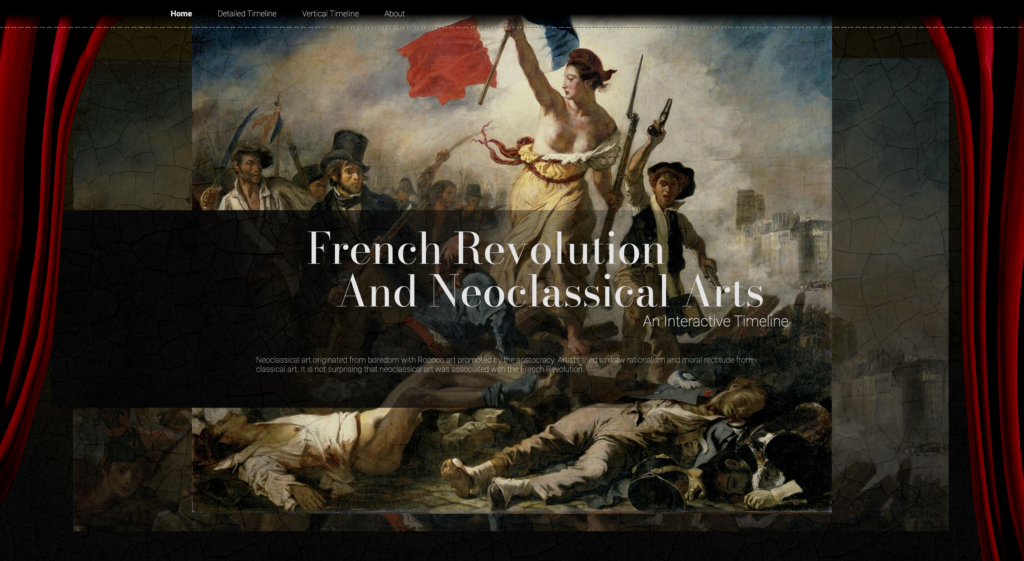
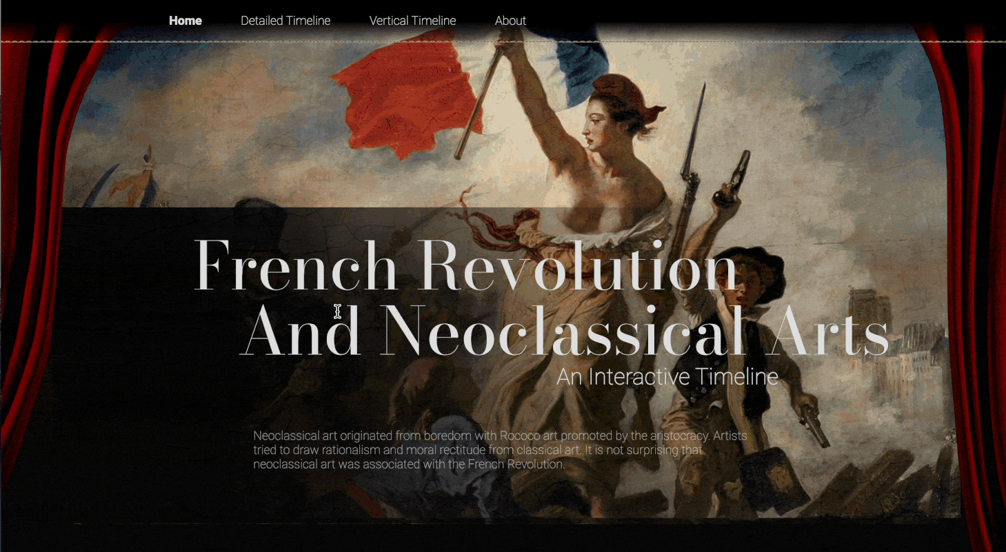
That’s why I want to design an interactive digital timeline that connects the French Revolution to neoclassical art works.
The neoclassical style was popular during the French Revolution and reflected the changing political, social, and cultural values of the time. By exploring how neoclassical art works were influenced by and reflected to the events of the revolution, the interactive digital timeline will provide a unique and visually engaging way to explain the complex historical incident.
Research
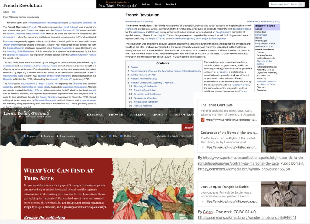
I conducted research on the French Revolution, gathering relevant historical documents and created a key events outline.
Design.
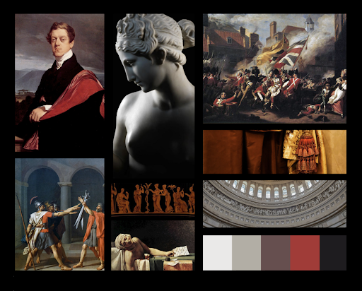
Moodborad
The moodboard utilizes black and red to reflect the sacrifice and conflict of the revolution, while also creating a solemn and tragic atmosphere through a reference to the red curtains of a theater.
Font
Font Family
- Bodoni Moda
- Times New Roman
- Roboto
- Helvetica
Font Weight
- Bold 500
- Medium 400
- Regular 300
- Thin 200
Color
Theme Color
#0D0D0D
#0D0D0D
#707070
#FADAB1
#E5E5E5
Size
Font Size
- Large 30px
- Lage Medium25px
- Medium 20px
- Meduim Small 18px
- Small 15px
- Small Small 13px
- Extra Small 10px
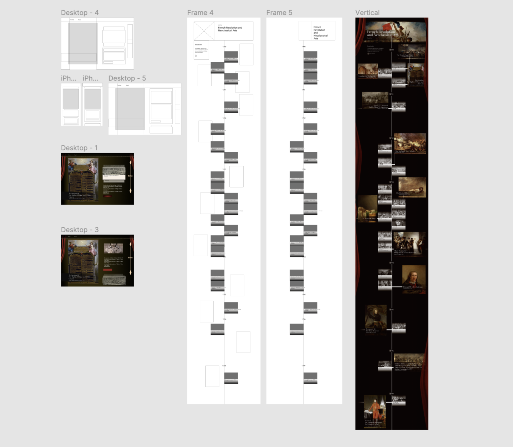
Wireframes
Development.
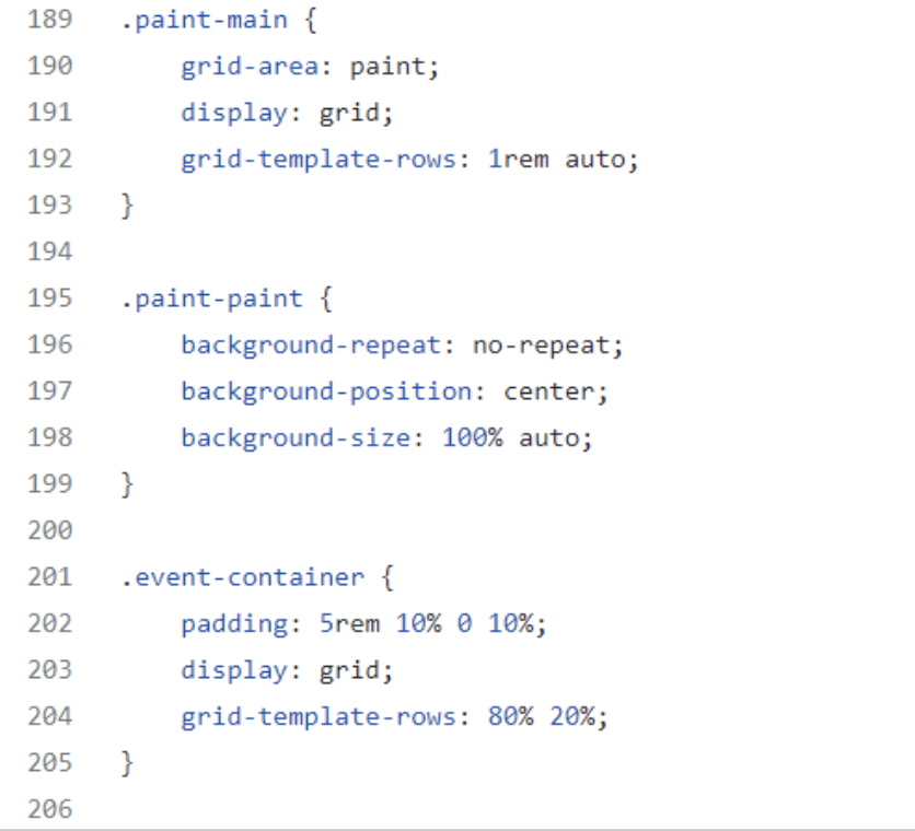
- To make the new pages more responsive, I used the grid layout which ensures responsiveness and adapts the layout to different screen sizes.
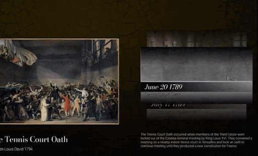
- Add more interactive elements. User can click on pictures, event cards, or hover over drawings to access external materials or more information.
- Apply animations to create a smooth and visually appealing transition between interactions
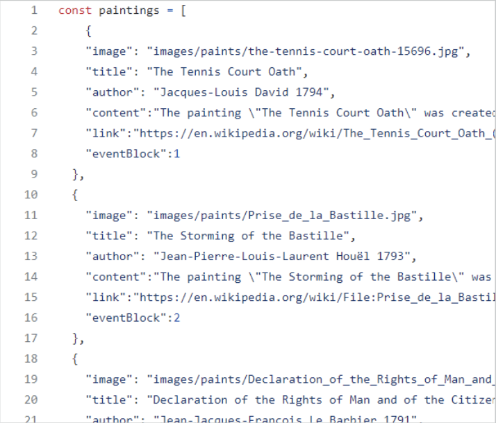
- Store all information in separate arrays. Due to time limitations, a database was not used.
- Use index to show the correlation between paintings and events, allowing one display to trigger another.
- The design was created with the idea of mimicking a relational dataset, making it easy for developers to replace the information without impacting the functionality side.
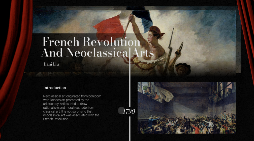
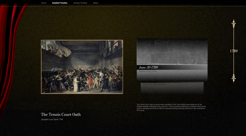
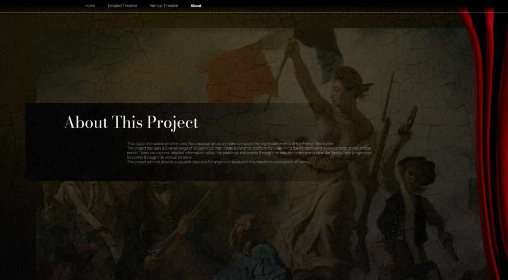
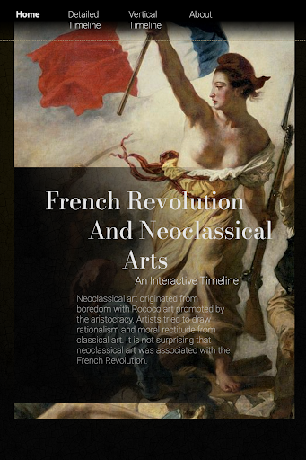
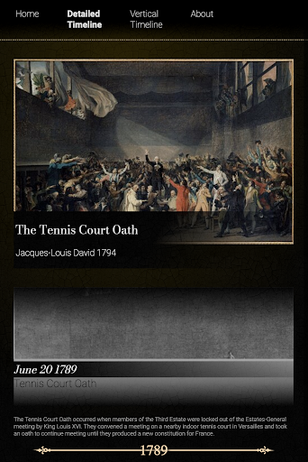
Result.
Takeaways.
What I’ve Learned…
This project was aimed at displaying information in a linear and organized manner. Based on my design and programming experience, I have several takeaways, which will be valuable for future data visualization and visual aid demonstration projects.
- Consider the layout method carefully and ensure responsiveness from the beginning.
- Conduct responsive testing to identify problems early.
- Avoid using after/before elements to prevent difficulties in managing the DOM.
- Consider the relationships between different information blocks and design function and dataset accordingly.